

Website refreshes for UK private clinics

Your website is your clinic's first consultation.

Patients form a view of your clinic in the first moment they land on it — long before they read a word. Tell us your web address and we'll send you a free written review of what that first moment is doing, and what we would change.

Free, no obligation, written by a person. One more field and you're done.

Rather see the work first? View a before and after.

Elysian Aesthetics homepage.
Before

The same clinic, before and after a refresh. Same treatments, same practitioners, same prices — only the first thing a patient meets has changed.

Why you are here

We looked at your clinic before we contacted you.

We do not send blanket emails. Before we get in touch we open the site on a phone, time how long it takes to load, and try to book an appointment the way a patient would. Six things get checked. The same six things get fixed.

If your site already does its job, we will say so plainly and leave you alone. That happens more often than you would expect, and it costs us nothing to be straight about it.

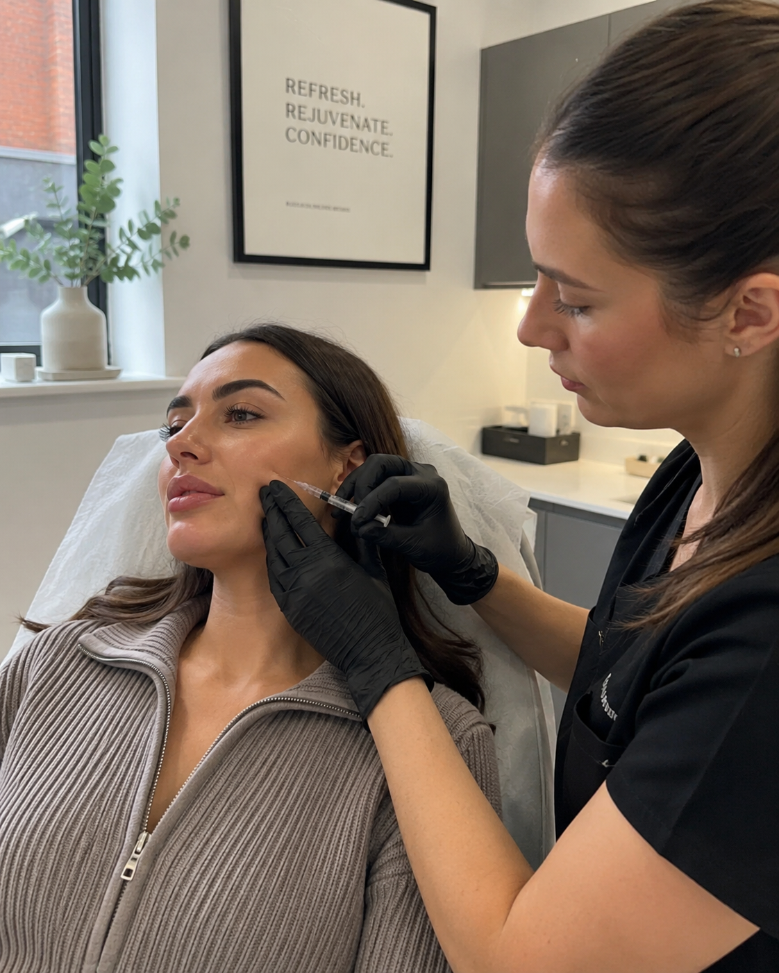
A clinician talking with a patient in a calm consulting room.
01
Mobile presentation

How the clinic looks on the screen most patients actually use.

02
Loading experience

Timed on a phone, on mobile data — not on office broadband.

03
Patient trust signals

Qualifications, registrations and reviews, where a nervous patient looks for them.

04
Treatment navigation

Whether a patient can find the treatment they came for in one tap.

05
Consultation journey

How many steps stand between interest and a booked appointment.

06
Clarity of the next step

One obvious action per page, rather than a phone number in the footer.

The evidence

Patients decide before they read a word.

A patient researching a £2,000 treatment behaves like a patient researching anything else: they form a view in the first moment, and they form it largely from design. The research on this is consistent, and worth stating carefully.

94%

In a study of how people judge health websites, 94% of the reasons given for distrusting a site related to its design rather than its content.

Sillence, Briggs et al., Northumbria University, 2004
75%

Three quarters of consumers say they judge an organisation's credibility partly on how its website looks.

Stanford Web Credibility Project, Fogg et al.
53%

Over half of mobile visits are abandoned when a page takes longer than three seconds to load.

Google / SOASTA mobile speed research, 2017

None of these figures measures clinical skill. That is the point: a patient weighing up three clinics at nine in the evening is making a trust judgement in seconds, on a phone, before your reputation gets a hearing.

The transformation

The same clinic. A different decision.

Nothing about this clinic has changed — same treatments, same practitioners, same prices. Only the experience a patient meets first. Drag the handle, then open the notes to see exactly what moved and why.

Drag to compare · arrow keys work too

BeforeAfter
The same clinic after a Refresh Lab website refresh

Review notes

"Welcome to our website!" and a wall of centred textOne headline that says what the clinic is, in the clinic's voice

A patient should know within two seconds what this clinic does and for whom.

Gradient header, rotated offer badge, six competing coloursA restrained palette with one accent, used only on actions

Visual calm reads as clinical competence. When only the booking button carries colour, the eye knows where to go.

Typography from the browser's defaults, set smallA deliberate type scale with clear hierarchy

Patients skim. Strong hierarchy lets the page be understood from headlines alone.

Refresh concepts

Three clinics. Three different arguments.

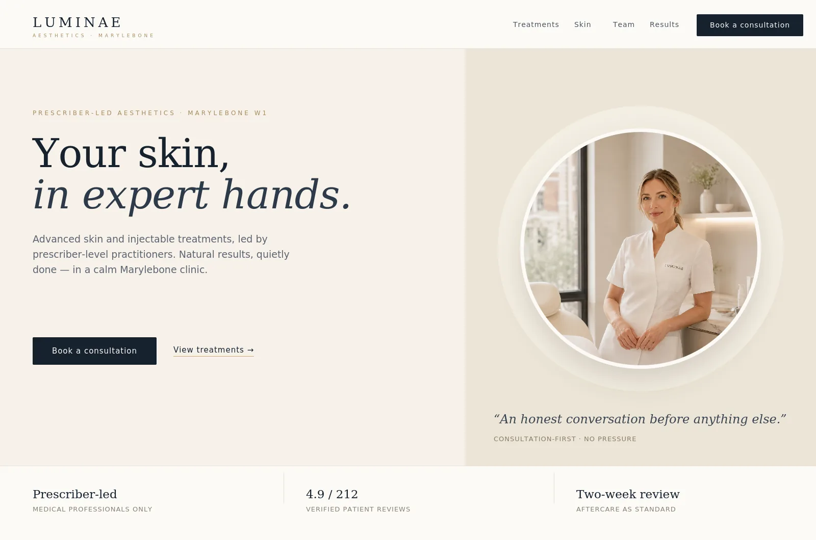
A refresh is not a template with your logo on it. Each of these is built around a different kind of patient decision, and looks different because the decision is different. Drag any handle to see the dated site each one replaced. These are concepts we designed to show the standard — labelled as such. Named client work will appear here as current projects complete.

BeforeAfter refresh
Refreshed Elysian Aesthetics homepage.
Elysian Aesthetics' previous website.

Drag to compare

Concept · Aesthetic clinic

Elysian Aesthetics

Editorial restraint. Warm stone, serif display, almost no colour.

The problem
Aesthetic patients are anxious buyers. Most clinic sites answer "what do you offer?" when the patient is asking "can I trust you?"
What the refresh changed
Stronger visual credibility, clearer treatment navigation and a booking call to action that reaches a consultation in two taps — borrowing the calm authority of the publications this audience already trusts.
BeforeAfter refresh
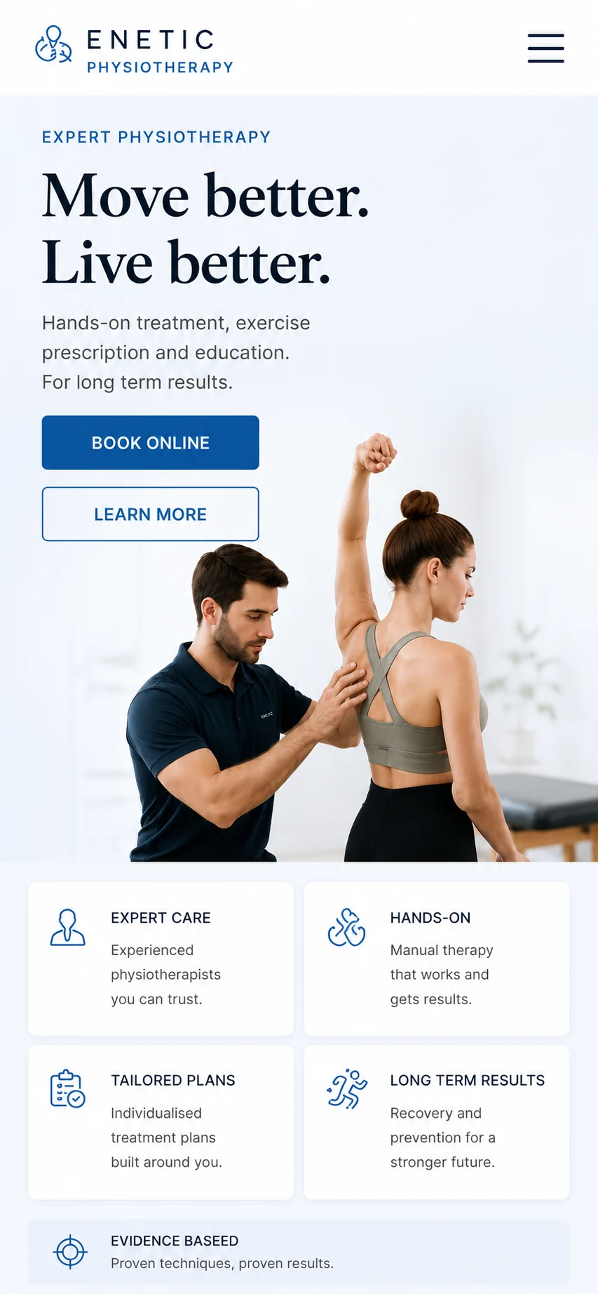
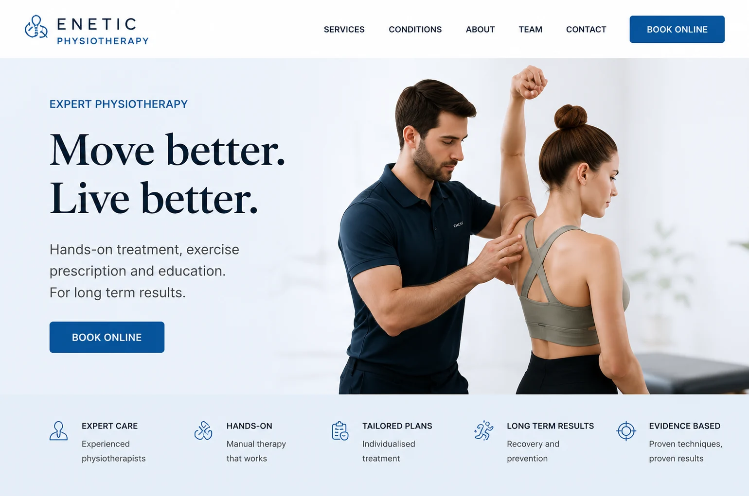
Refreshed Kinetic Physiotherapy homepage.
Kinetic Physiotherapy's previous website.

Drag to compare

Concept · Physiotherapy clinic

Kinetic Physiotherapy

Practitioner-led. Clean, confident, built for the phone first.

The problem
The clinic's practitioners were its strongest asset and were buried on an About page. Most visits arrived on a phone, where the old layout collapsed into pinch-and-zoom.
What the refresh changed
Named, qualified practitioners brought above the fold, conditions explained in patient language rather than clinical shorthand, and one obvious next step per page — designed for the phone first, tested on real devices.
BeforeAfter refresh
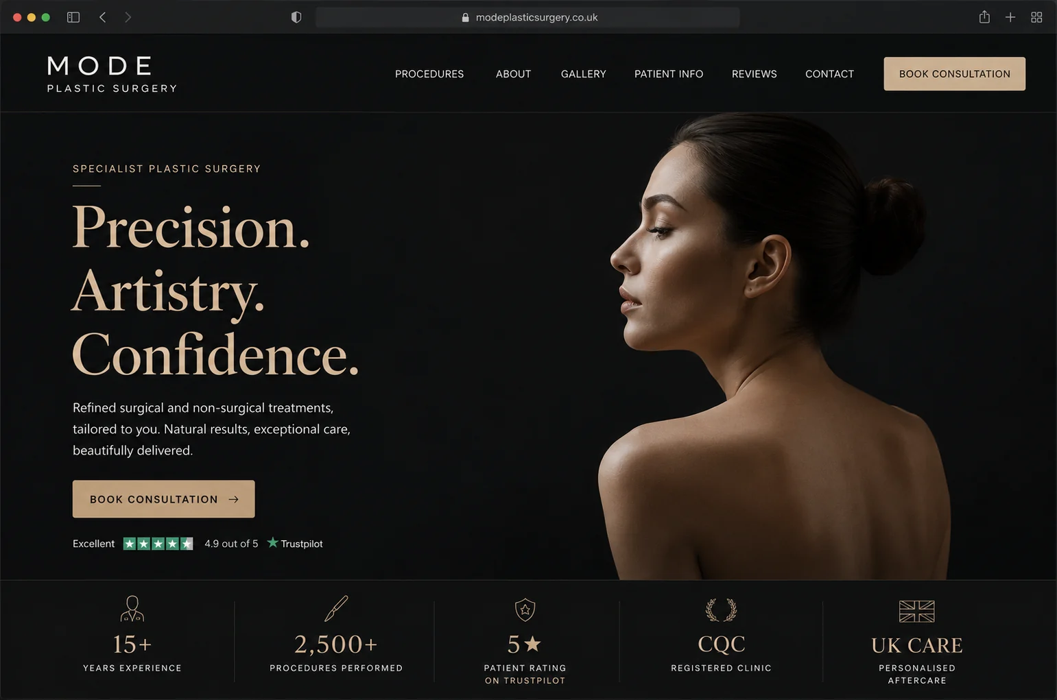
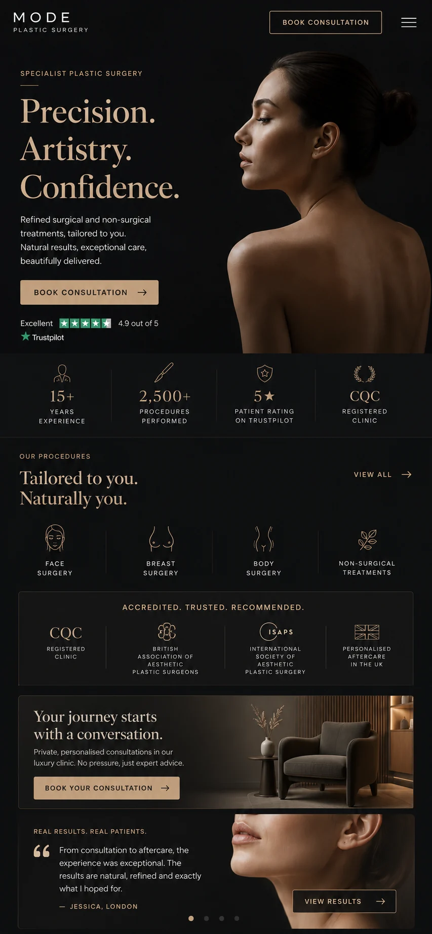
Refreshed Mode Plastic Surgery homepage.
Mode Plastic Surgery's previous website.

Drag to compare

Concept · Plastic surgery clinic

Mode Plastic Surgery

Dark, refined luxury. Restraint and craft over discounting.

The problem
Surgical patients are high-consideration and risk-averse. Discount badges and "award-winning" claims read as exactly the overselling that erodes trust in an audience weighing a significant, personal decision.
What the refresh changed
A restrained, editorial interface signals genuine surgical expertise rather than a bargain. Credentials — years in practice, procedure volume, CQC registration — carry the credibility, and "book a consultation" is framed as a private, no-pressure first step.

The process

Four steps. Most of the work is ours.

Clinic owners do not have time to project-manage a website. You give the process about two hours in total: one call at the start, one sign-off at the end.

Wireframes, type samples and clinic-website mockups laid out during a refresh.
  1. 01

    Review

    We go through your current site the way a patient meets it — on a phone, at speed, trying to book. You get the findings in writing, whether or not you go ahead.

    20 minutes of your time
  2. 02

    Refresh

    Design, build and copy, using your branding where it works. You see the homepage direction before anything else is built, so there are no surprises.

    Two to three weeks
  3. 03

    Launch

    Redirects mapped, rankings protected, speed tested on real devices. Your booking system carries on exactly as it is.

    Handled entirely by us
  4. 04

    Afterwards

    You keep the site, the training to update it, and thirty days of support. The measure that matters is enquiries, so that is what we look at together.

    30 days included

Works with your back office

Keep the system you already run.

Your new website plugs into the booking and practice-management software your clinic already uses — so nothing about your back office has to change. Patients book on your site; the appointment lands exactly where your team already works.

  • Pabau
  • Phorest
  • Fresha
  • Consentz
  • Dentally
  • Software of Excellence
  • Carestream
  • Cliniko
  • WriteUpp
  • Nookal
  • Semble
  • Meddbase
  • See all integrations →

Running something that isn’t listed? See the full list, or just tell us — we connect to most UK clinic systems.

Scope and price

What you get, and what it costs.

One focused engagement, priced in writing before any work begins. No hourly billing, no retainer you have to argue your way out of.

£2,400 – £6,000 Most clinic refreshes land in this range. The variable is how many treatment pages you need, and whether photography and copy are included. Your fixed price comes after the free review.
  • A written website reviewYour current site, assessed the way a patient meets it. Yours to keep either way.
  • A homepage direction, agreed firstYou see and approve the look before anything else is built.
  • A mobile-first rebuildDesigned for the evening phone screen, with desktop following.
  • Pages that load before patients leaveBuilt lean, images compressed, code stripped back.
  • Treatment navigation that worksPatients find the treatment they came for in one tap.
  • A booking journey with no dead endsTreatment page to enquiry in two steps, on a phone.
  • Trust signals where patients lookQualifications, registrations and genuine reviews, placed at the point of doubt.
  • Google, handled properlyEvery URL mapped and redirected, clean structure, local schema, rankings protected.
  • Launch and thirty days of supportHosting setup, testing on real devices, and training to update it yourself.
  • Ongoing careSome clinics keep us on afterwards. Some never need to. No lock-in either way.

Patients buy trust before they buy treatment.

Every clinic owner we speak to says a version of the same thing: our patients come from word of mouth. That is usually true. It is also incomplete — because the recommendation is not the end of the journey, it is the beginning. Someone hears your name at a dinner table, and the next thing they do, often that same evening, is look you up on their phone.

Your website is your clinic's first consultation. It happens whether you are in the room or not.

This matters more in private healthcare than almost anywhere else, because the purchase is personal, discretionary and frequently anxious. A patient considering an injectable, an implant or a hair transplant is not comparing feature lists. They are asking one question: do I trust these people with my face? They answer it with whatever evidence is in front of them — the photography, whether the site feels current, whether the practitioners are named and qualified, whether it works on their phone.

Which is the frustrating part, and the opportunity. The clinics losing enquiries to a dated website are rarely the weaker clinics. They are excellent practices being judged on a five-year-old design decision nobody has had time to revisit. That is the entire job. We make the first consultation match the standard of the second.

Who we are

A small UK studio, not a lead-gen machine.

Refresh Lab is a three-person creative studio. The people who review your site are the people who design and build it. You will not be handed to an account manager, and you will not be sold anything on the review call.

  • Based inUnited Kingdom
  • Studio sizeThree people
  • Clients we take onPrivate clinics only
  • Talk to us directlyhello@wearerefreshlab.com
RussCo-founder — strategy and clinic growth

Spent years selling clinic management software to UK aesthetics practices, which mostly meant watching good clinics lose enquiries for reasons that had nothing to do with their clinical work. Runs the reviews.

William FlynnCo-founder — design

Leads the design direction on every refresh. Responsible for the homepage you sign off before anything else gets built.

Oliver FlynnCo-founder — build and launch

Handles the build, the redirect mapping and the launch. The part where rankings get protected rather than gambled.

Questions

The things clinic owners ask us.

You get a written review of your current website — what a patient meets first, where the enquiry journey breaks, and the changes we would make in priority order. It is yours to keep and act on, with us or with anyone else. The catch, such as it is: we only write these for clinics we would like to work with, and roughly one in three reviews ends with us saying the site is fine as it is.

Refreshes start at £2,400 and most clinic projects land between £2,400 and £6,000, depending on how many treatment pages you need and whether photography and copy are included. You get a fixed price in writing after the review. No hourly billing, no surprises.

Most clinic sites go live in three to four weeks from the review being signed off. Larger sites with treatment libraries and multiple locations run to six. You get a schedule with dates at the start, not a vague estimate.

No, provided it is done carefully — which is the point of the review. We map every existing URL, redirect it properly, keep the content that earns traffic and improve the technical foundations. Rankings usually improve, because speed and structure are ranking factors.

Yes. Plenty of clinics have a logo and identity they have invested in, and we work within it. Where the brand itself is holding the clinic back we will say so and show you the options, but nothing changes without your agreement.

Everything. Design, build, copy, images, hosting setup, redirects and launch. We work with your existing booking system rather than replacing it. The only thing we need from you is a couple of hours: one review call and one sign-off.

You get the site, the training to update it, and thirty days of support included. Some clinics keep us on for ongoing work and some do not need to. There is no lock-in either way.

Probably yes, if only for the review. It costs you nothing, you keep the findings whether you work with us or not, and it is useful ammunition for any conversation about your website.

The free review

See what we would change.

Two fields. We review your current site the way a patient meets it and send back a written refresh direction. You keep the findings whether you work with us or not.

  1. 1We open your site on a phone and time it.
  2. 2We write up the highest-impact opportunities.
  3. 3It lands in your inbox within one working day.
  4. 4There is no call unless you ask for one.

We reply within one working day. Your details are used only to prepare and send your review — nothing else, and no list.

Prefer to just reply to our email? hello@wearerefreshlab.com reaches the same three people.

Get a free review of my site